Xochimilco
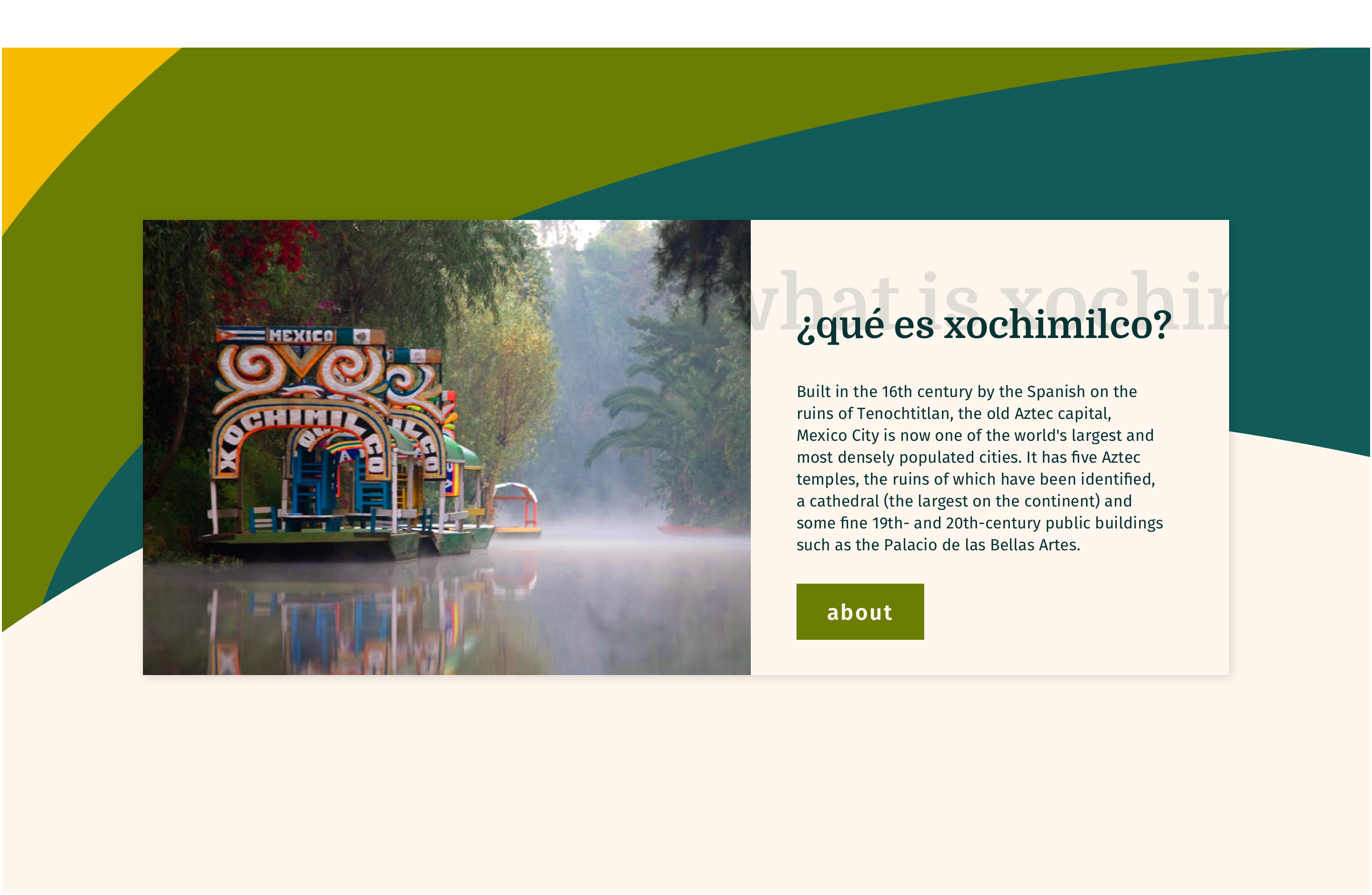
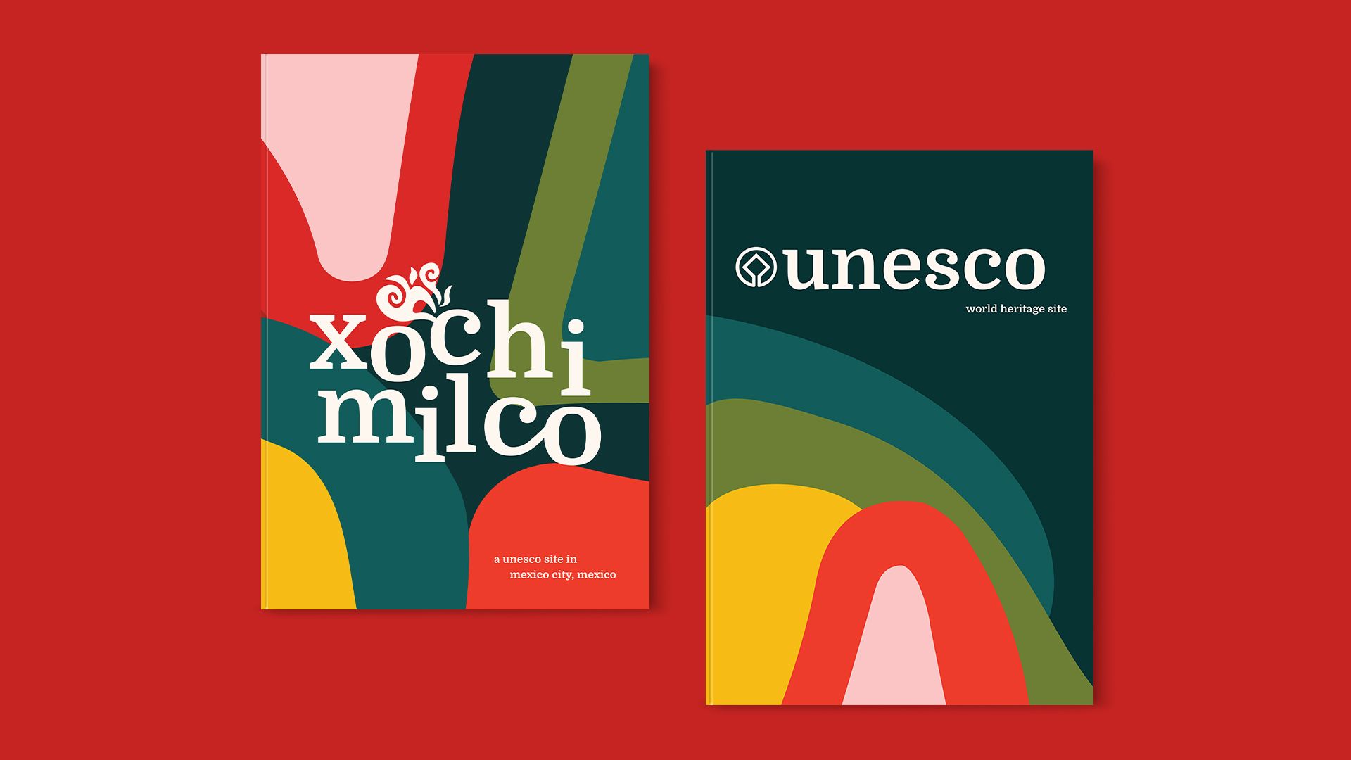
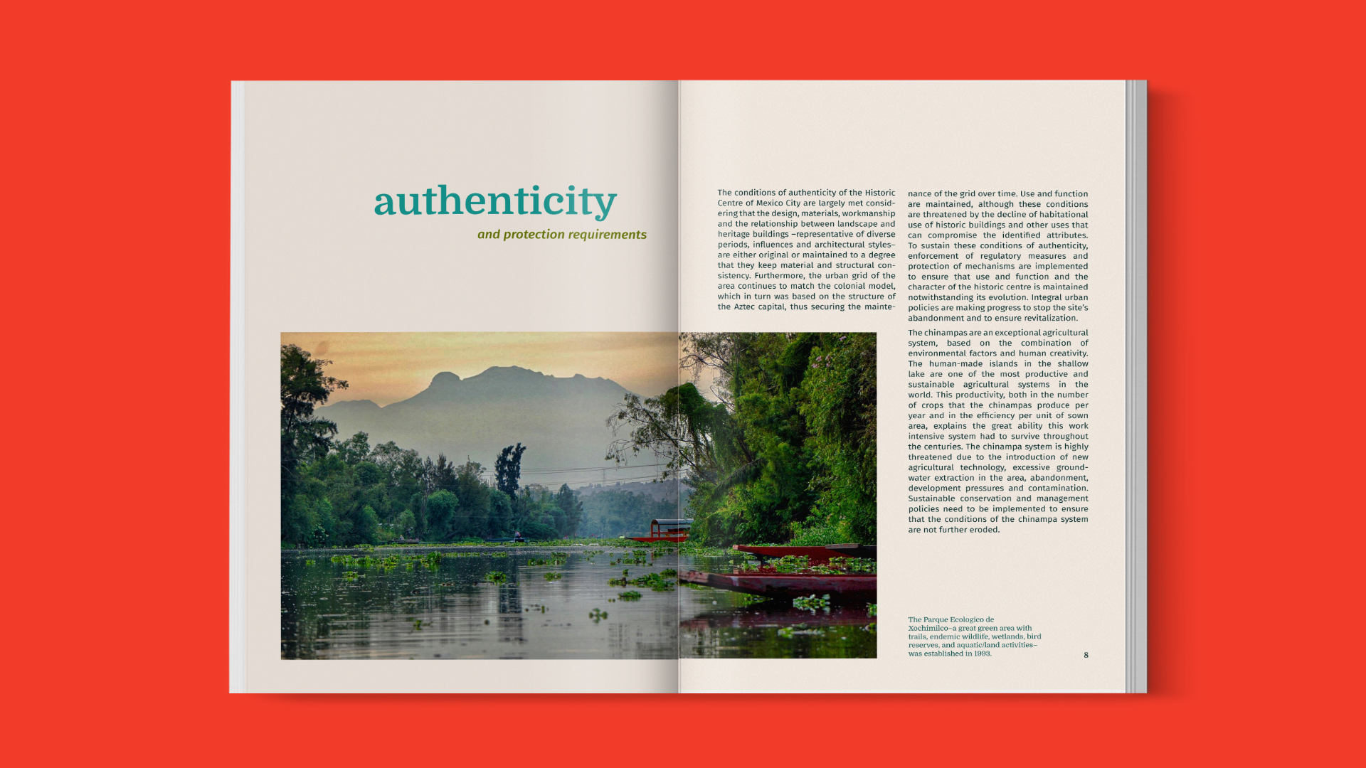
Sharing a part of my name with this beautiful UNESCO site, this project was particularly special to me. Originally the Aztec capital, Xochimilco testifies to the efforts of the Aztec people to build a habitat in the midst of an unfavorable environment. Characterized by the brightly colored boats that run down the canals, I wanted the branding for Xochimilco to reflect the organic beauty that encompasses the location.
Process + branding
I spent a lot of time trying to get a feel for the area and its attractions. The atmosphere is festive and the colors are bright, and it was important that the colors I chose reflected this.
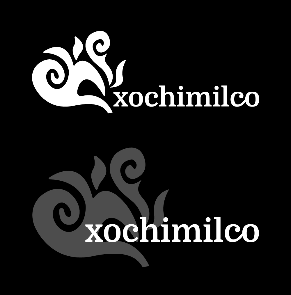
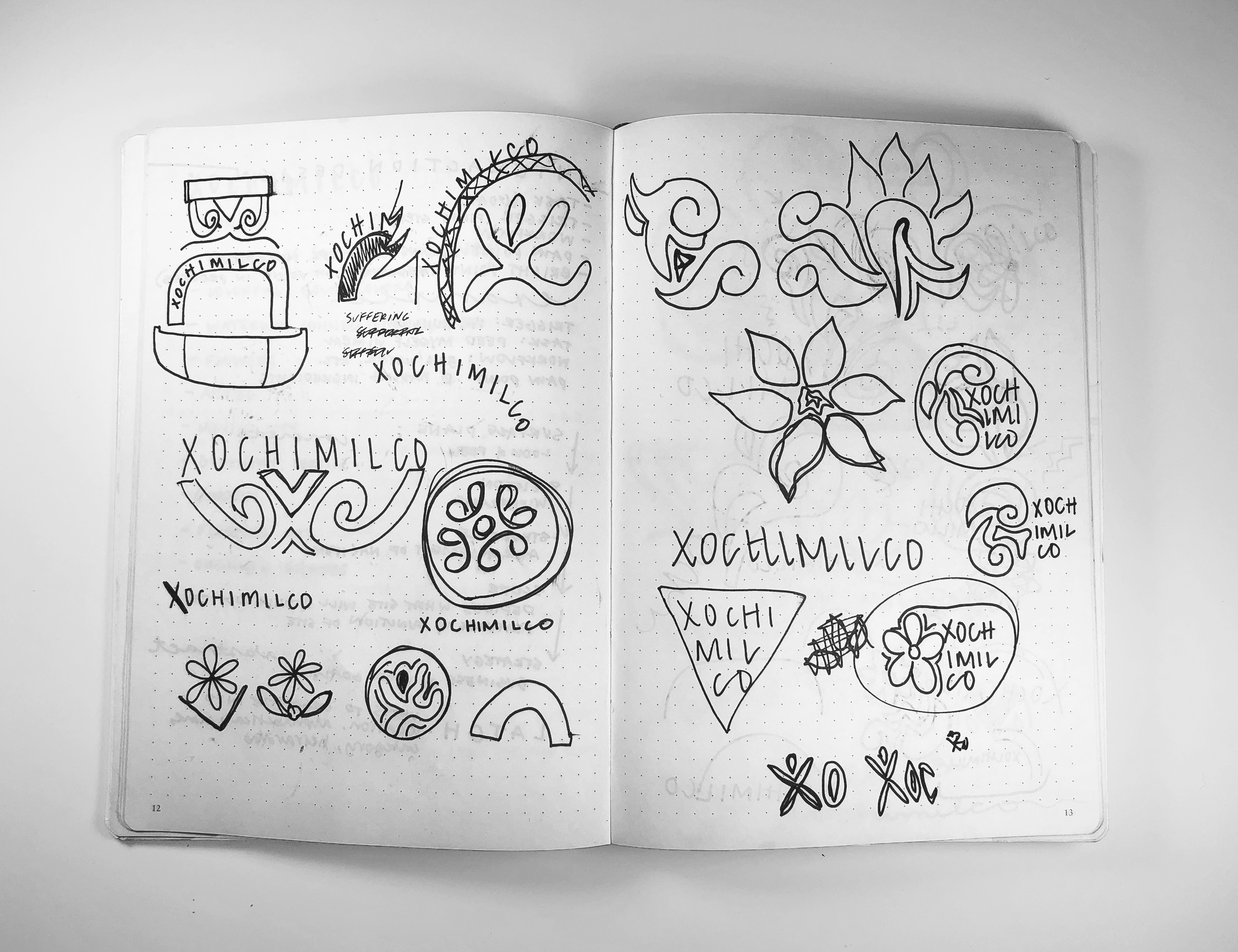
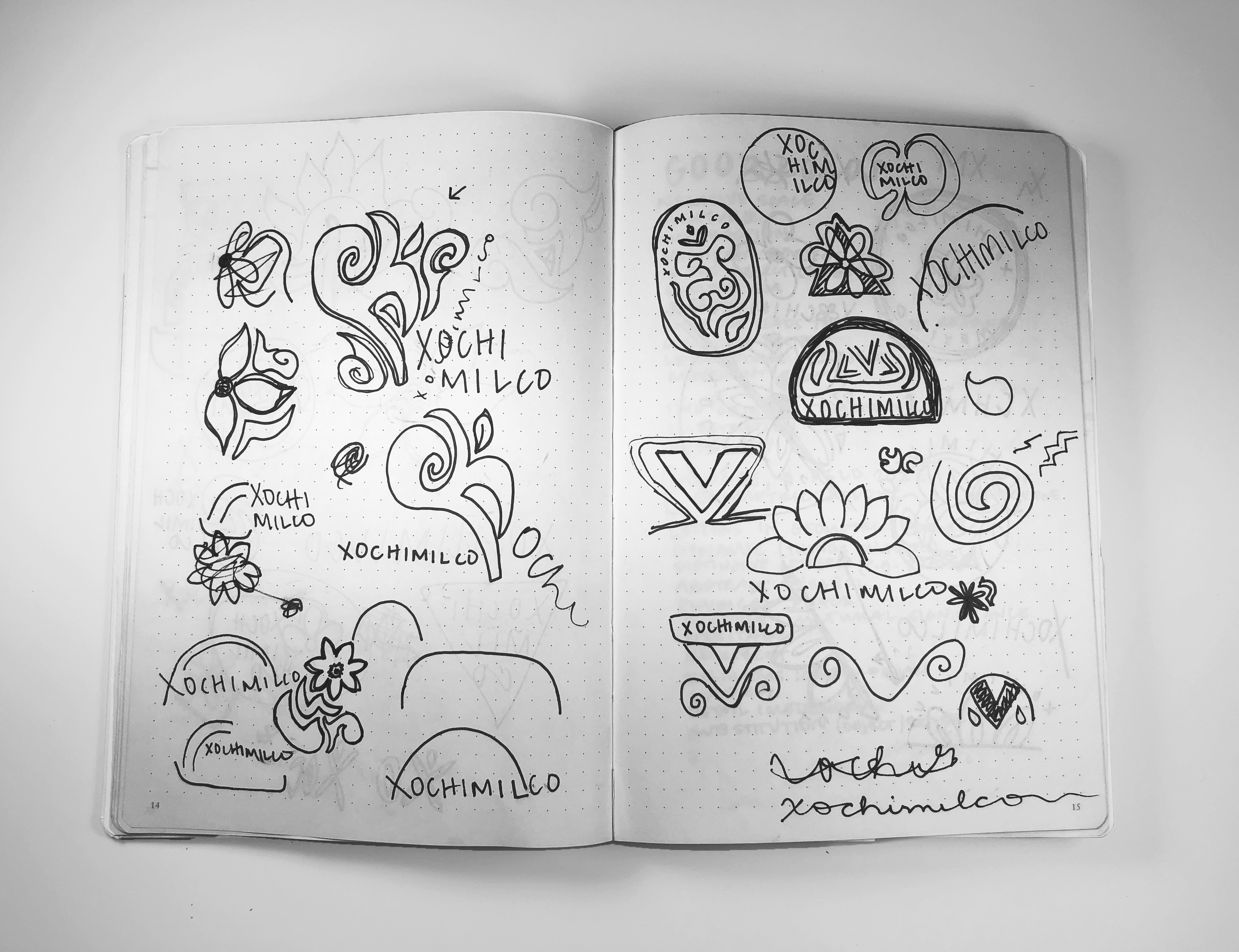
For the logo, I thought about the different elements of Xochimilco that I wanted to acknowledge: the flowers, the water, and the boats. I eventually settled on a version of the organic shapes painted on each boat that I sketched. I refined the mark and created two versions of the logo: a standard one-color version and a modified version that overlapped the type and mark.
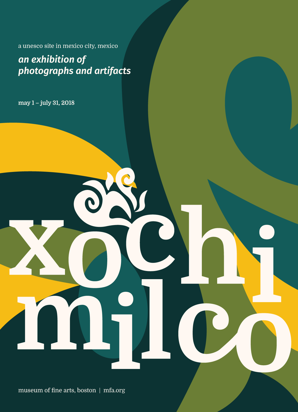
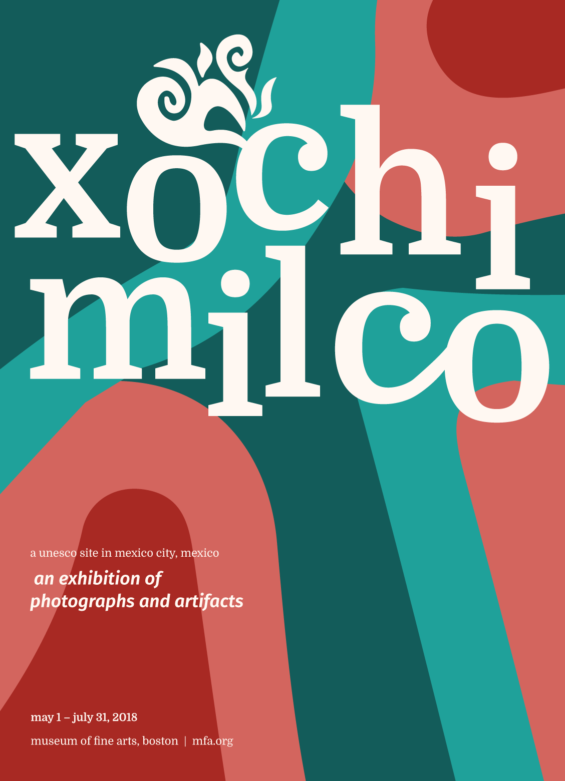
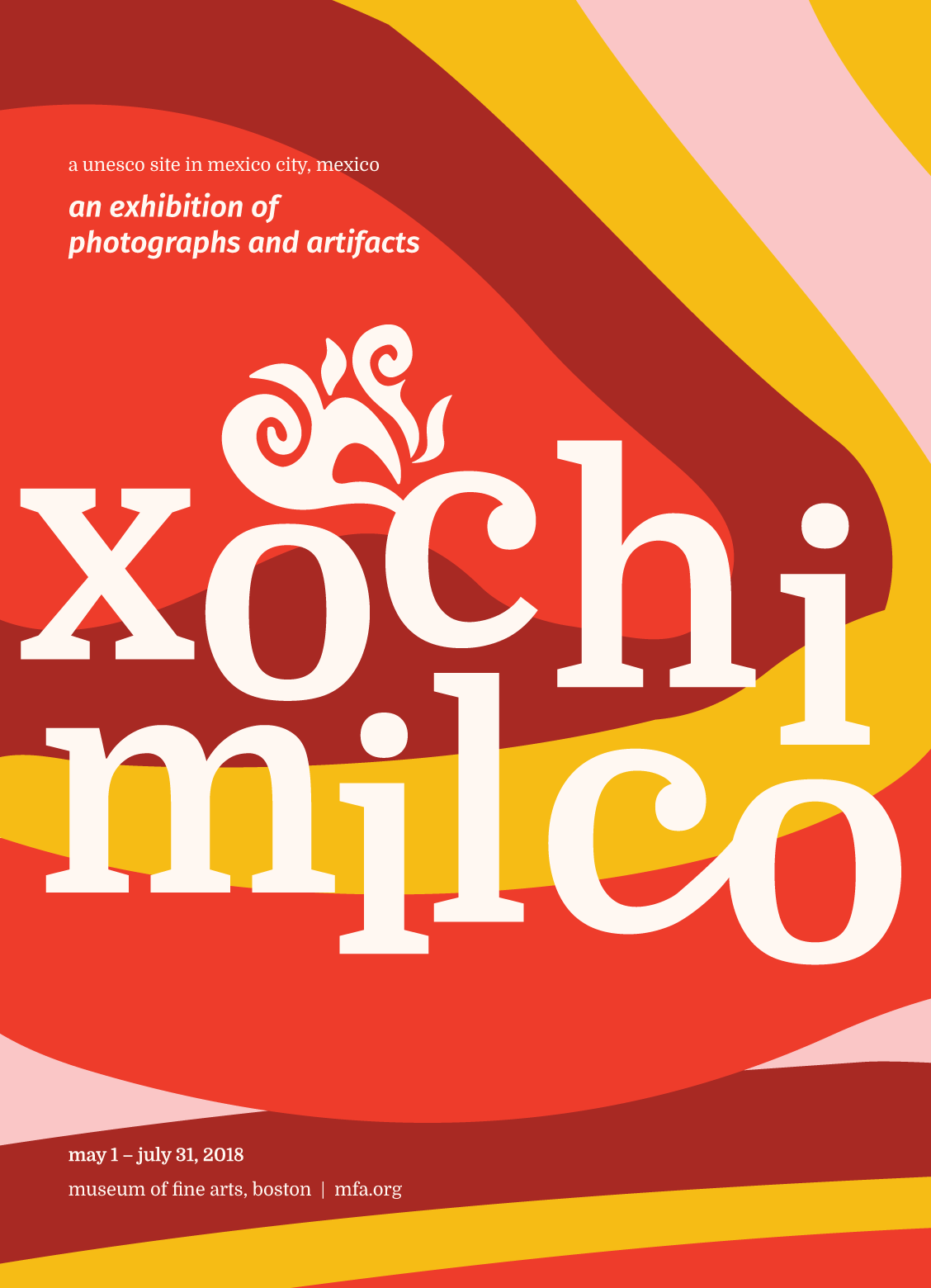
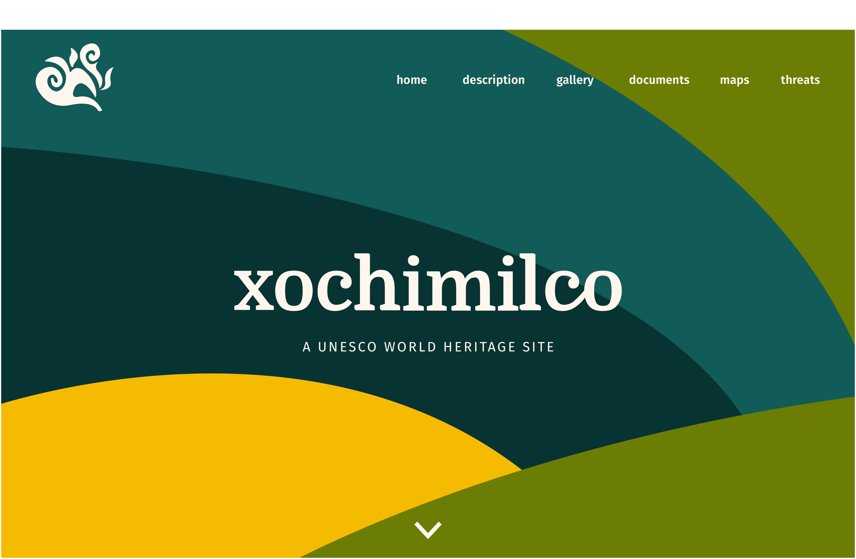
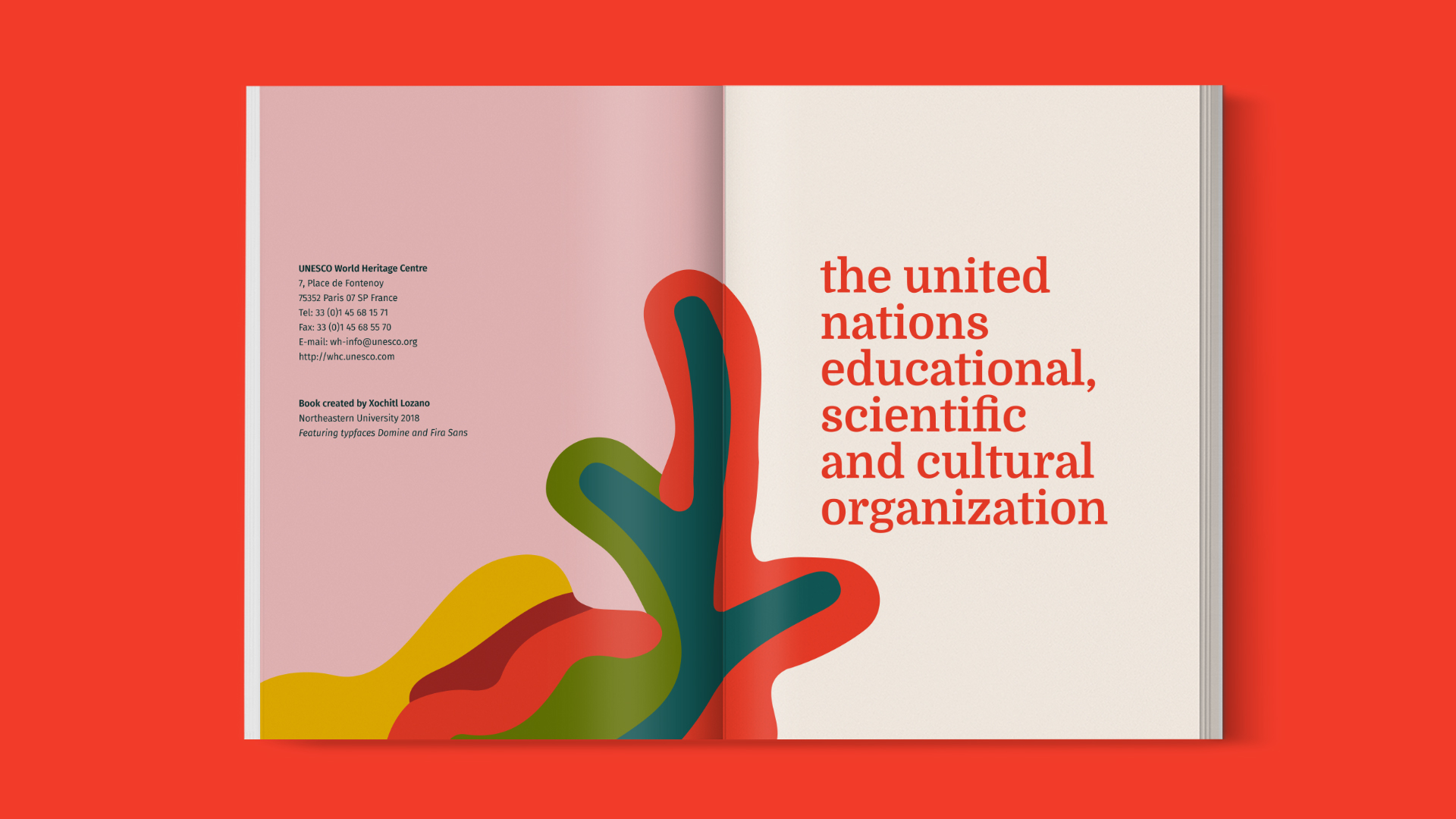
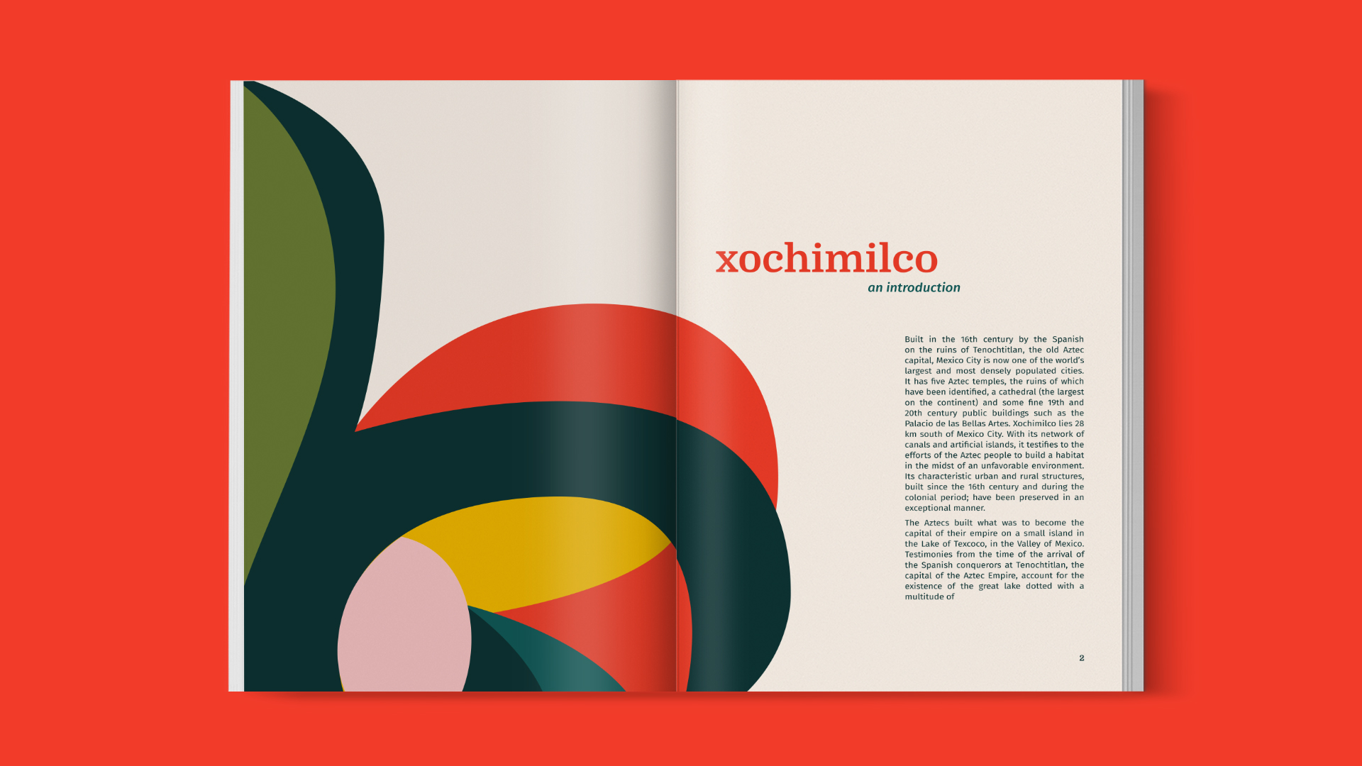
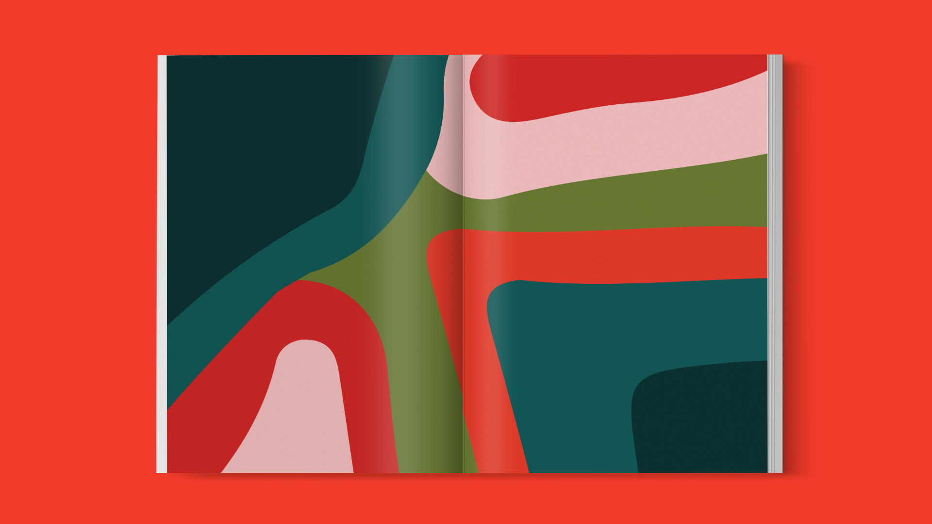
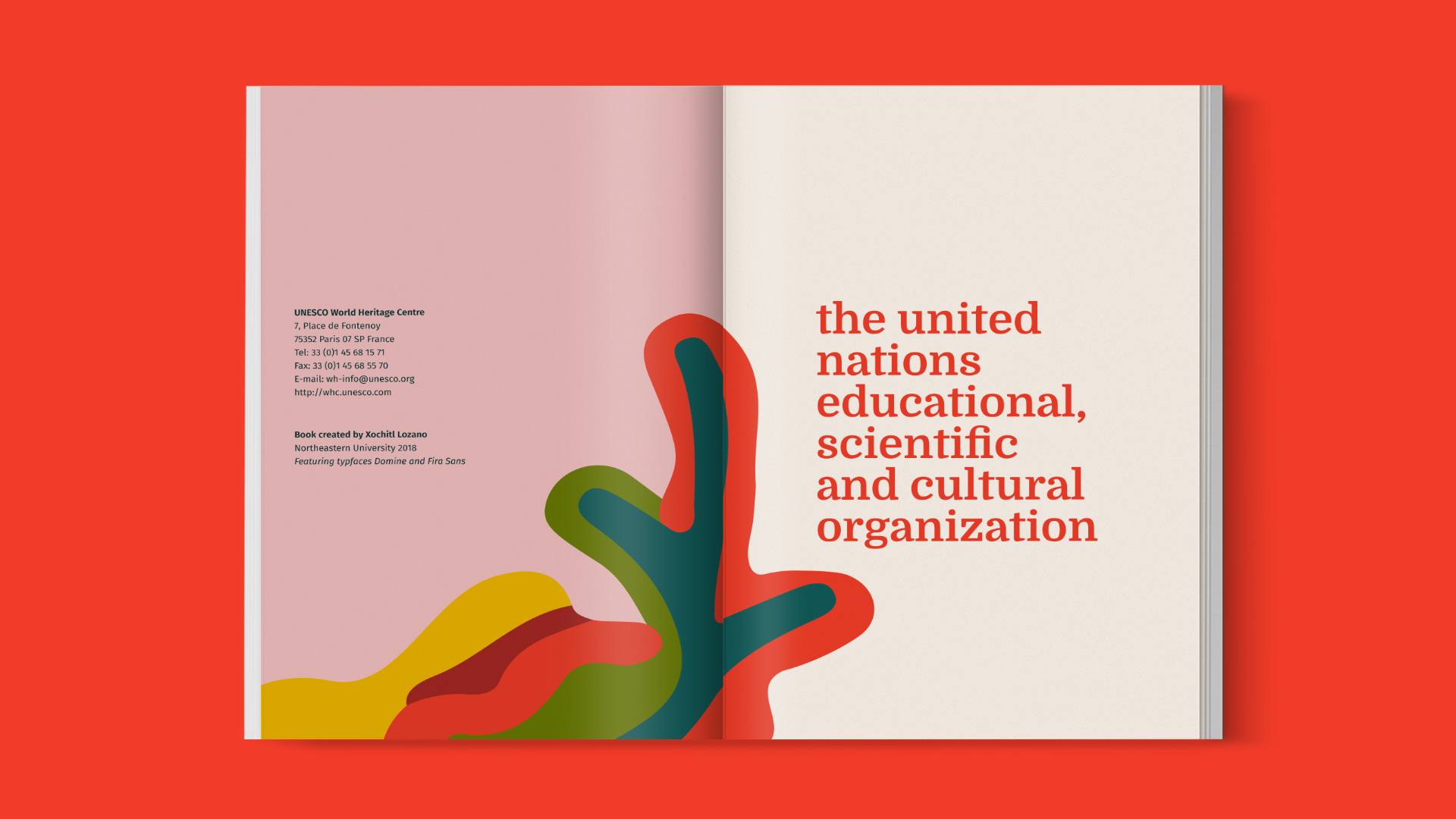
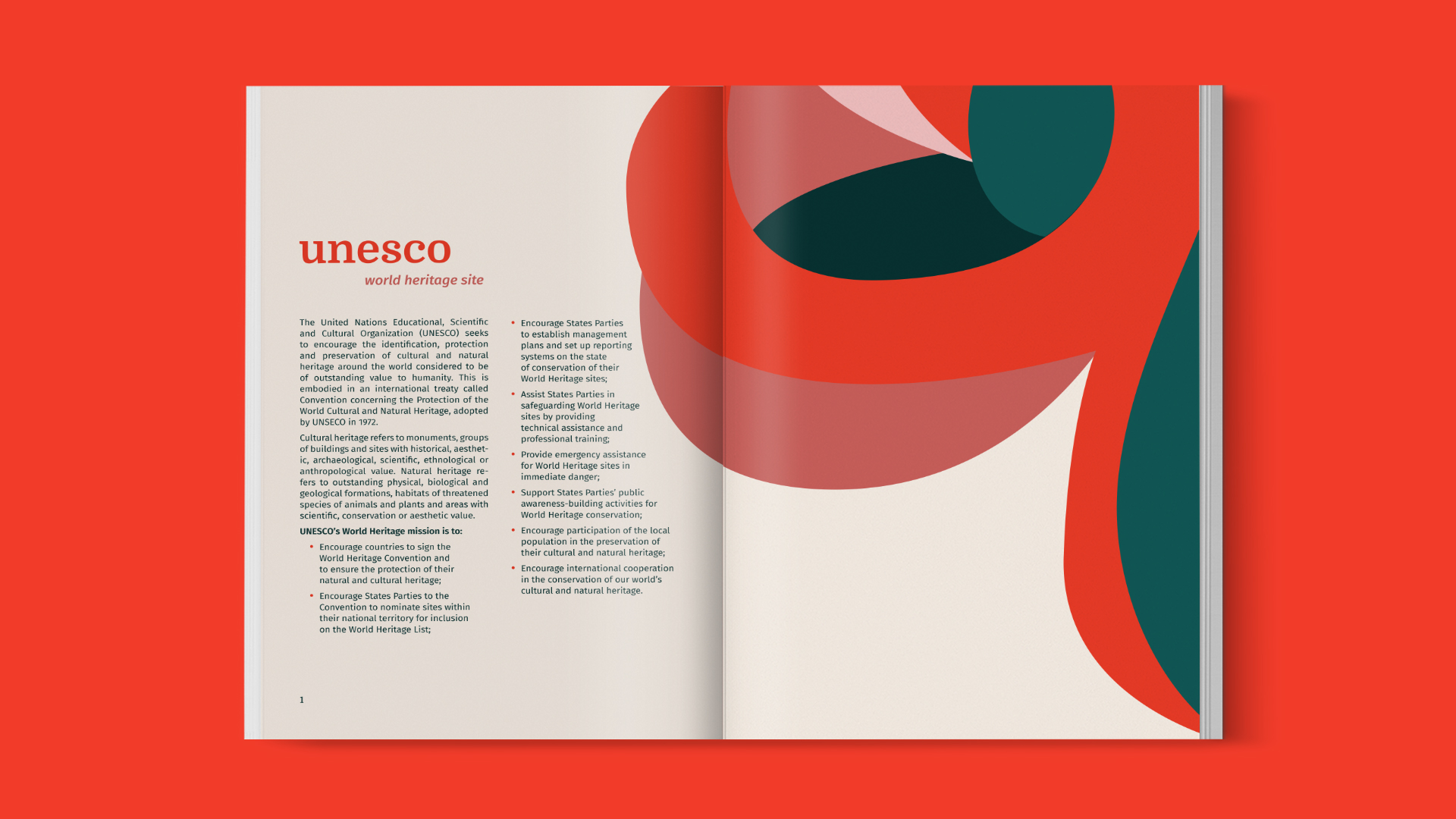
After the initial branding explorations, I created a full range of branding materials for Xochimilco. Focusing on vibrant colors and interesting shapes, I created collatoral that featured illustrative backgrounds and a bold use of Xochimilco’s name.

